
Today internet is flooded with articles on effective web design, creative web design and inspiring web design as well. But now I aim at showing how you SHOULDN’T design your site and what faults one need to be aware of. Experience keeps a dear school, so save your time and nerves and profit somebody else’s mistakes.
Here comes the list of deleterious advices you need to ignore when creating a good site design:
· Complicate it!
The multiple columns filled with heterogeneous information shouldn’t be restricted by any side panels or bounds of decency. The more complicated, the better. Make your visitor run the quest to find what he came for.
· Color it bright.
You also consider acid pink to be the perfect match for bright green? Then don’t limit your creativeness with that stupid rules of combinability and go ahead.
· Minimal font.
In our case minimal print means that the visitor will need to hug the monitor tight to read the text. And generally, he can go to library if he really wants to read something.
· Don’t be shy and advertise.
Advertise as much as you can, let the bright and blinking banners cover the page – it’s really interesting and useful after all. Give your visitor a chance to find the things he never meant to look for.
· Play around with manner and matter.
Use at least five font types and styles, change them whenever possible. This will surely produce the unforgettable effect.
· Require the registration.
Make all the visitors register before proceeding to your site. The procedure is to take around 15 minutes and illegible captcha is a must.
· Sophisticate the navigation.
Create the labyrinth of sections and pages so that the visitor will forget what he wants before he finds the Services page.
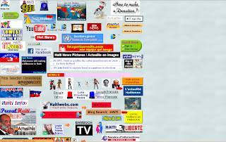
And to finish with here are some bright samples of brilliant web design.


No comments:
Post a Comment